Chart renders a small inline chart from one numeric series. Use it for compact dashboards, weekly summaries, trend previews, and similar single-series visualizations.
Python Contract
sdk.ui.Chart(
    id: str,
    chart_type: str = "Line",
    data: list[Any] | None = None,
    labels: list[str] | None = None,
    title: str | None = None,
)
The constructor writes these properties:
chartTypedatawhen a non-empty list is providedlabelswhen a non-empty list is providedtitlewhen provided
Common layout and visibility properties such as style, show_if, hide_if, and required_permissions still apply through the base component contract.
Supported Properties
| Property | Type | Required | Python | YAML | Desktop | Web | Notes |
|---|---|---|---|---|---|---|---|
id |
str |
yes | yes | yes | yes | yes | Stable component id |
chart_type / chartType |
str |
no | yes | yes | yes | yes | Supported variants are bar, line, area |
data |
list[number] |
no | yes | yes | yes | yes | Single numeric series |
labels |
list[str] |
no | yes | yes | yes | yes | One label per data point |
title |
str |
no | yes | yes | yes | yes | Optional title above the chart |
max_height |
int |
no | via set_property |
yes | yes | responsive container sizing | Use it to keep compact chart previews consistent |
max_width |
int |
no | via set_property |
yes | yes | responsive container sizing | Useful when the chart sits in a constrained dashboard area |
style |
str |
no | yes | yes | yes | yes | Prefer applying layout styling on the surrounding card or column |
show_if |
rule | no | yes | yes | yes | yes | Generic visibility contract |
hide_if |
rule | no | yes | yes | yes | yes | Generic visibility contract |
required_permissions |
list[str] |
no | yes | yes | yes | yes | Generic visibility contract |
Variants
Use chart_type to choose the visual form of the same single-series dataset.
bar: category comparisonline: trend reading across ordered pointsarea: trend with filled volume emphasis
Renderer Behavior
Desktop:
- Uses
pyqtgraph. - Renders nothing useful if
datais missing or empty. - Accepts
chartTypeand also tolerateschart_typeduring render. - Uses
max_heightandmax_widthdirectly on the widget. - Draws the title inside the plotting widget.
Web:
- Renders an SVG chart inside a card.
- Returns an empty-state card when
datais missing or empty. - Supports
bar,line, andarea. - Uses a fixed internal SVG view box and scales responsively in the card.
- Ignores
max_heightandmax_widthin the current renderer.
Chart is best used for one ordered numeric series with its labels and optional title.
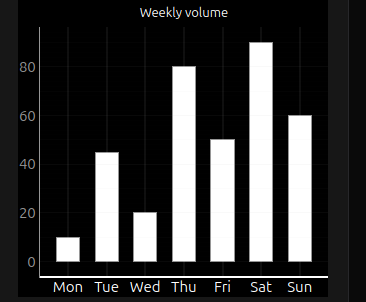
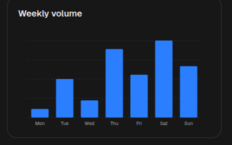
Bar Example
chart = sdk.ui.Chart(
    "weekly_volume",
    chart_type="bar",
    data=[10, 45, 20, 80, 50, 90, 60],
    labels=["Mon", "Tue", "Wed", "Thu", "Fri", "Sat", "Sun"],
    title="Weekly volume",
)
chart.set_property("max_height", 300)
- kind: Chart
id: weekly_volume
chart_type: "bar"
data: [10, 45, 20, 80, 50, 90, 60]
labels: ["Mon", "Tue", "Wed", "Thu", "Fri", "Sat", "Sun"]
title: "Weekly volume"
max_height: 300Desktop rendering:
Web rendering:
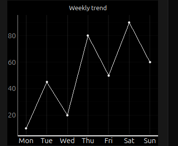
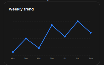
Line Example
chart = sdk.ui.Chart(
    "weekly_trend",
    chart_type="line",
    data=[10, 45, 20, 80, 50, 90, 60],
    labels=["Mon", "Tue", "Wed", "Thu", "Fri", "Sat", "Sun"],
    title="Weekly trend",
)
chart.set_property("max_height", 300)
- kind: Chart
id: weekly_trend
chart_type: "line"
data: [10, 45, 20, 80, 50, 90, 60]
labels: ["Mon", "Tue", "Wed", "Thu", "Fri", "Sat", "Sun"]
title: "Weekly trend"
max_height: 300Desktop rendering:
Web rendering:
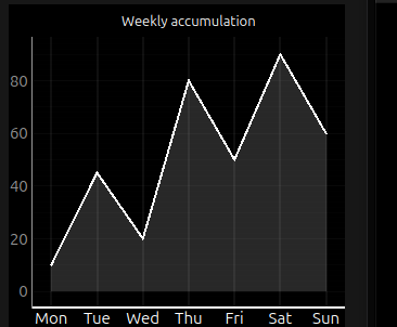
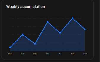
Area Example
chart = sdk.ui.Chart(
    "weekly_accumulation",
    chart_type="area",
    data=[10, 45, 20, 80, 50, 90, 60],
    labels=["Mon", "Tue", "Wed", "Thu", "Fri", "Sat", "Sun"],
    title="Weekly accumulation",
)
chart.set_property("max_height", 300)
- kind: Chart
id: weekly_accumulation
chart_type: "area"
data: [10, 45, 20, 80, 50, 90, 60]
labels: ["Mon", "Tue", "Wed", "Thu", "Fri", "Sat", "Sun"]
title: "Weekly accumulation"
max_height: 300Desktop rendering:
Web rendering:
Store Binding Example
Bind chart properties to the page store when actions need to change the visible series without rebuilding the page. Use the same store paths from the action that updates chart state.
from democrai.sdk.ui import bound

chart = sdk.ui.Chart(
    "components_test_chart_bound",
    chart_type=bound.store(
        "/components_test/chart/chart_type",
        scope="page",
        default="bar",
    ),
    data=bound.store(
        "/components_test/chart/data",
        scope="page",
        default=[10, 45, 20, 80, 50, 90, 60],
    ),
    labels=bound.store(
        "/components_test/chart/labels",
        scope="page",
        default=["Mon", "Tue", "Wed", "Thu", "Fri", "Sat", "Sun"],
    ),
    title=bound.store(
        "/components_test/chart/title",
        scope="page",
        default="Weekly volume",
    ),
)
chart.set_property("max_height", 300)
- kind: Chart
id: components_test_chart_yaml_bound
chart_type:
type: store
scope: page
path: /components_test/chart/chart_type
default: bar
data:
type: store
scope: page
path: /components_test/chart/data
default: [10, 45, 20, 80, 50, 90, 60]
labels:
type: store
scope: page
path: /components_test/chart/labels
default: ["Mon", "Tue", "Wed", "Thu", "Fri", "Sat", "Sun"]
title:
type: store
scope: page
path: /components_test/chart/title
default: "Weekly volume"
max_height: 300Data Model Binding Example
Bind chart properties to the surface data model when the chart should follow data loaded or updated for the current surface. Actions can refresh the same model path with a dataModelUpdate.
from democrai.sdk.ui import bound

chart = sdk.ui.Chart(
    "components_test_chart_data_bound",
    chart_type=bound.data(
        "/components_test/chart_model/chart_type",
        default="bar",
    ),
    data=bound.data(
        "/components_test/chart_model/data",
        default=[10, 45, 20, 80, 50, 90, 60],
    ),
    labels=bound.data(
        "/components_test/chart_model/labels",
        default=["Mon", "Tue", "Wed", "Thu", "Fri", "Sat", "Sun"],
    ),
    title=bound.data(
        "/components_test/chart_model/title",
        default="Weekly volume",
    ),
)
chart.set_property("max_height", 300)
- kind: Chart
id: components_test_chart_yaml_data_bound
chart_type: "@data/components_test/chart_model/chart_type"
data: "@data/components_test/chart_model/data"
labels: "@data/components_test/chart_model/labels"
title: "@data/components_test/chart_model/title"
max_height: 300Visibility And Permissions Example
show_if and hide_if can use store bindings so actions can toggle chart visibility. required_permissions gates the chart on the current user permissions; it is client-side UI gating and does not replace backend authorization.
from democrai.sdk.ui import bound

show_if_chart = sdk.ui.Chart(
    "components_test_chart_show_if",
    chart_type="bar",
    data=[18, 42, 65, 38],
    labels=["Q1", "Q2", "Q3", "Q4"],
    title="show_if visible",
).set_property("max_height", 300).set_show_if(
    {
        "conditions": [
            {
                "left": bound.store(
                    "/components_test/visibility/show_chart",
                    scope="page",
                    default=True,
                ),
                "op": "==",
                "right": True,
            }
        ]
    }
)

hide_if_chart = sdk.ui.Chart(
    "components_test_chart_hide_if",
    chart_type="line",
    data=[12, 24, 20, 36],
    labels=["Q1", "Q2", "Q3", "Q4"],
    title="hide_if not hidden",
).set_property("max_height", 300).set_hide_if(
    {
        "conditions": [
            {
                "left": bound.store(
                    "/components_test/visibility/hide_chart",
                    scope="page",
                    default=False,
                ),
                "op": "==",
                "right": True,
            }
        ]
    }
)

permission_chart = sdk.ui.Chart(
    "components_test_chart_required_permissions",
    chart_type="area",
    data=[8, 28, 46, 52],
    labels=["Q1", "Q2", "Q3", "Q4"],
    title="required_permissions gate",
).set_property("max_height", 300).set_required_permissions(
    ["components.chart.visibility"]
)
- kind: Chart
id: components_test_chart_yaml_show_if
chart_type: "bar"
data: [18, 42, 65, 38]
labels: ["Q1", "Q2", "Q3", "Q4"]
title: "show_if visible"
max_height: 300
show_if:
conditions:
- left:
type: store
scope: page
path: /components_test/visibility/show_chart
default: true
op: "=="
right: true
- kind: Chart
id: components_test_chart_yaml_hide_if
chart_type: "line"
data: [12, 24, 20, 36]
labels: ["Q1", "Q2", "Q3", "Q4"]
title: "hide_if not hidden"
max_height: 300
hide_if:
conditions:
- left:
type: store
scope: page
path: /components_test/visibility/hide_chart
default: false
op: "=="
right: true
- kind: Chart
id: components_test_chart_yaml_required_permissions
chart_type: "area"
data: [8, 28, 46, 52]
labels: ["Q1", "Q2", "Q3", "Q4"]
title: "required_permissions gate"
max_height: 300
required_permissions:
- components.chart.visibilityUsage Guidance
- Use
Chartwhen one compact series is enough. - Keep
dataandlabelsaligned by index. - Prefer
barfor category comparison,linefor trend reading, andareafor cumulative or volume-like emphasis. - For runtime changes, prefer store bindings or targeted property updates over rebuilding the full page.