Purpose
Button renders an explicit user action trigger. It can dispatch an action, pass static or bound context, collect mounted input values, show a loading state while an action is pending, and receive runtime property updates.
Constructor
Button(
    id: str,
    label: str,
    action: str | None = None,
    params: dict | None = None,
    icon: str | None = None,
    variant: str = "default",
    mode: str = "solid",
    appearance: str | None = None,
    btnsize: str = "normal",
    shape: str = "default",
)
Properties
| Property | Type | Default | Description |
|---|---|---|---|
label |
str or literal/bound payload |
required | Visible text. Python constructor wraps plain labels as literalString. |
action |
str or action object |
none | Action dispatched on click. Action objects can include confirm. |
params |
dict |
{} |
Extra click context merged with the action context. |
icon |
str |
none | Icon name. Remix icon names can use ric.*, ri.*, or ri-* forms. |
variant |
str |
default |
Visual intent. Documented values are default, primary, success, warning, info, and danger. |
mode |
str |
solid |
Legacy appearance mode: solid, ghost, or link. |
appearance |
str |
none | Optional appearance override such as default, ghost, or link. |
btnsize |
str |
normal |
Size. Supports sm, default, lg and legacy small, normal, large. |
shape |
str |
default |
default, round, or icon. icon is normalized as a round icon button by the web client. |
active |
bool or condition/binding |
false |
Active visual state. |
collect_input_ids |
list[str] |
[] |
Input ids collected and included in click context. |
track_loading |
str | list[str] |
none | Action names that put the button in loading state while pending. |
show_if / hide_if |
condition | none | Shared visibility rules. |
required_permissions |
list[str] |
[] |
Required permissions before rendering. |
capabilities |
list[str] |
default interactive capabilities | Required for direct runtime updates such as label.set, active.set, action.set, and params.set. |
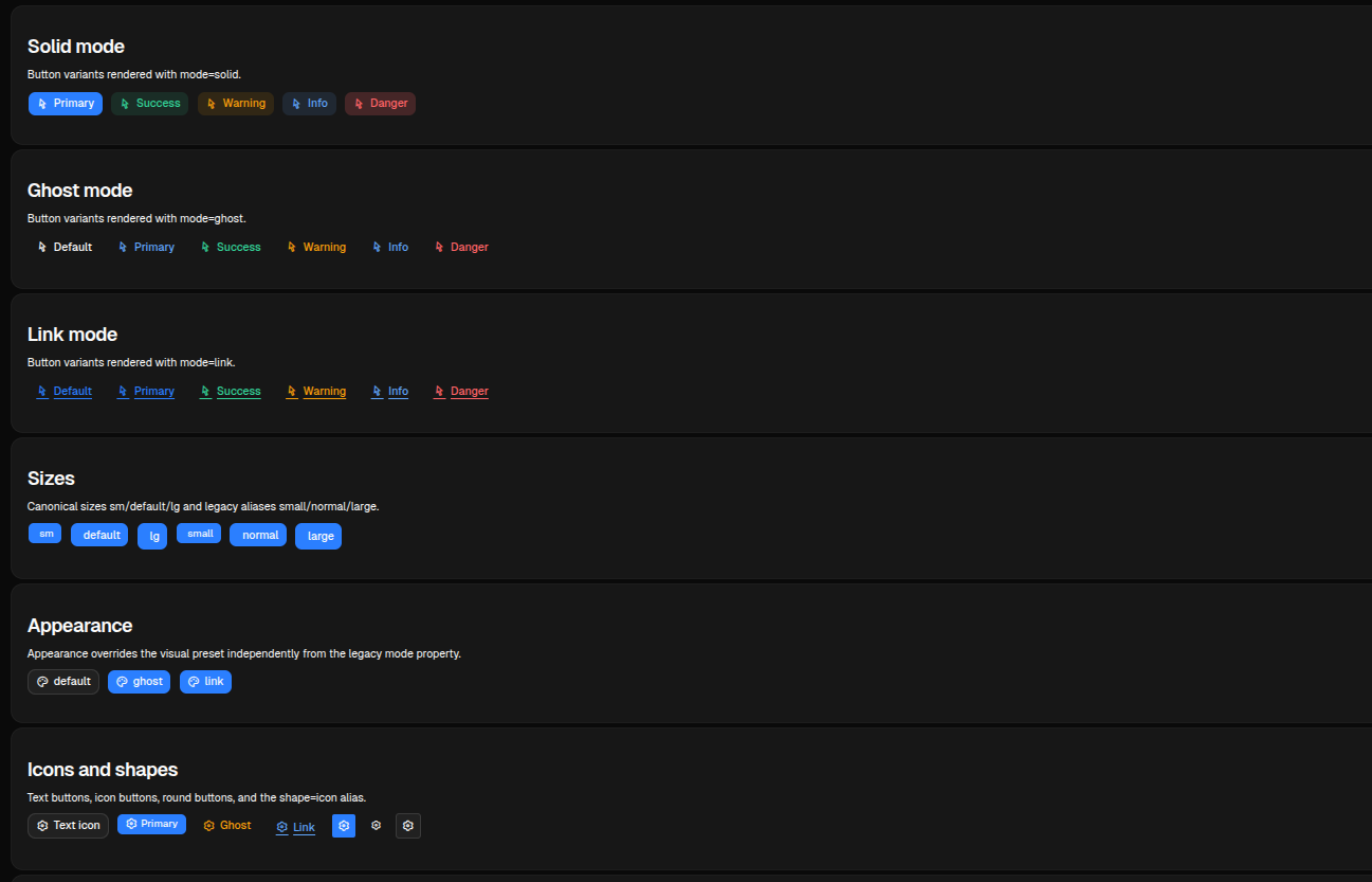
Variants, Modes And Icons
The test page renders variant matrices for solid, ghost and link modes, plus icon and icon-only combinations.
sdk.ui.Button("save", "Save", variant="primary", icon="ric.save-line")
sdk.ui.Button("delete", "Delete", variant="danger", icon="ric.delete-bin-line")
sdk.ui.Button("ghost", "Ghost", variant="warning", mode="ghost", icon="ric.alert-line")
sdk.ui.Button("link", "Open", variant="info", mode="link", icon="ric.external-link-line")
sdk.ui.Button("icon_only", "", variant="primary", shape="round", icon="ric.settings-3-line")
sdk.ui.Button("icon_alias", "", variant="default", shape="icon", icon="ric.settings-3-line")
- kind: Button
id: save
label: Save
variant: primary
icon: ric.save-line
- kind: Button
id: ghost
label: Ghost
variant: warning
mode: ghost
icon: ric.alert-line
- kind: Button
id: icon_only
label: ""
variant: primary
shape: round
icon: ric.settings-3-lineAction Context
In Python, pass action as the action name and params as extra context. In YAML, either use the same action plus params shape or the action object form.
Module actions used by UI components must be fully qualified, for example components.test_button_echo. The Python decorator keeps the local action name, while the component dispatch uses module.action. See Action Dispatch.
button = sdk.ui.Button(
    "run_import",
    "Run import",
    action="components.test_button_echo",
    params={"source": "toolbar"},
    variant="primary",
    icon="ric.play-circle-line",
)
- kind: Button
id: run_import
label: Run import
action: components.test_button_echo
params:
source: toolbar
variant: primary
icon: ric.play-circle-lineThe action receives the merged context. If collect_input_ids is present, the clients also collect the current values of those mounted inputs.
field = sdk.ui.TextField("title_input", "Title", "Initial value")
button = sdk.ui.Button(
    "collect_title",
    "Collect input",
    action="components.test_button_collect",
    params={"input_id": "title_input"},
    variant="primary",
)
button.collect_input_ids("title_input")
- kind: TextField
id: title_input
label: Title
value: Initial value
- kind: Button
id: collect_title
label: Collect input
action: components.test_button_collect
params: {input_id: title_input}
collect_input_ids: [title_input]
variant: primaryAction Confirmation
Use an action object with confirm to require confirmation before the click action is dispatched. If the user cancels the dialog, no backend action is sent.
The component test page exposes a trigger counter and the last received payload so the dispatch can be checked directly after confirming.
button = sdk.ui.Button(
    "confirm_python",
    sdk.i18n.t("components.button.confirm.python_primary"),
    variant="primary",
)
button.set_prop(
    "action",
    {
        "name": "components.button_confirm_action",
        "context": {"source": "python_primary"},
        "confirm": {
            "text": sdk.i18n.t("components.button.confirm.prompt"),
            "confirm_text": sdk.i18n.t("components.button.confirm.accept"),
            "cancel_text": sdk.i18n.t("components.button.confirm.cancel"),
        },
    },
)
- kind: Button
id: confirm_yaml
label: "@t/components.button.confirm.yaml_primary"
variant: primary
action:
name: components.button_confirm_action
context:
source: yaml_primary
confirm:
text: "@t/components.button.confirm.prompt"
confirm_text: "@t/components.button.confirm.accept"
cancel_text: "@t/components.button.confirm.cancel"Bindings And Direct Updates
label and active can be bound to page store or the surface data model in Python. In YAML, label is a constructor argument and is serialized as a literal label by the loader, so the YAML binding example uses active. Direct property updates can still target label in both Python and YAML when the button declares label.set.
from democrai.sdk.ui import bound

store_button = sdk.ui.Button("store_button", "Store label", variant="primary")
store_button.set_property(
    "label",
    bound.store(
        "/components_test/button/store_label",
        scope="page",
        default={"literalString": "Store label"},
    ),
)

data_button = sdk.ui.Button("data_button", "Data label", variant="default")
data_button.set_property(
    "label",
    bound.data(
        "/components_test/button_model/label",
        default={"literalString": "Data label"},
    ),
)

active_button = sdk.ui.Button("active_button", "Active", mode="ghost")
active_button.set_property(
    "active",
    bound.store("/components_test/button/active", scope="page", default=False),
)

live_button = sdk.ui.Button("live_button", "Direct label", variant="primary")
live_button.allow("label.set", "active.set", "action.set", "params.set")
- kind: Button
id: store_active_button
label: Store active
active: {type: store, scope: page, path: /components_test/button/active, default: false}
variant: primary
capabilities: [label.set, active.set, action.set, params.set]
- kind: Button
id: data_active_button
label: Data active
active: "@data/components_test/button_model/yaml_active"
variant: default
capabilities: [label.set, active.set, action.set, params.set]A direct label update uses the current surface id:
return sdk.effects.respond(
    sdk.effects.ui_property_update(
        "live_button",
        "label",
        {"literalString": "Direct label updated"},
        action="set",
        surface_id=ctx["_surface_id"],
    )
)
Visibility And Permissions
Buttons support the shared show_if, hide_if, and required_permissions contract.
button = sdk.ui.Button("guarded_button", "Guarded", variant="primary")
button.set_show_if({
    "conditions": [
        {"left": bound.store("/components_test/button/show", scope="page", default=True), "op": "==", "right": True}
    ]
})
button.set_hide_if({
    "conditions": [
        {"left": bound.store("/components_test/button/hide", scope="page", default=False), "op": "==", "right": True}
    ]
})
button.set_required_permissions(["components.button.use"])
- kind: Button
id: guarded_button
label: Guarded
variant: primary
show_if:
conditions:
- left: {type: store, scope: page, path: /components_test/button/show, default: true}
op: "=="
right: true
hide_if:
conditions:
- left: {type: store, scope: page, path: /components_test/button/hide, default: false}
op: "=="
right: true
required_permissions: [components.button.use]Behavior
- Desktop normalizes
small/normal/largetosm/default/lg. - Web maps
shape: iconto a round icon button. mode: ghostandmode: linkoverride the base visual style.track_loadingdisables the button and swaps the icon to a loading indicator while a tracked action is pending.
Screenshots
Desktop preview:
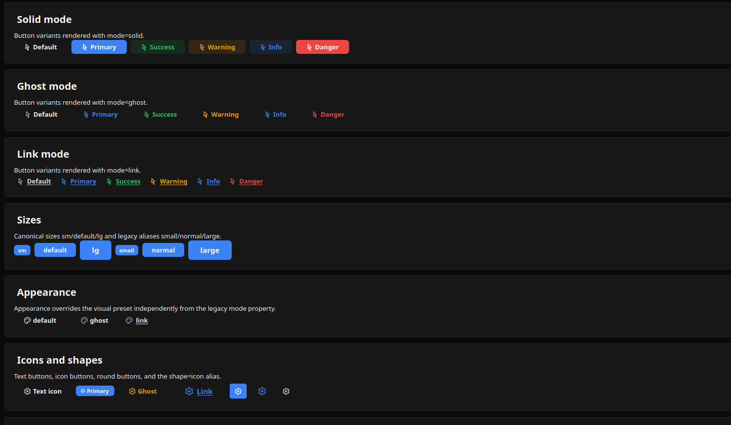
Web preview: