Purpose
Wizard renders a multi-step workflow with a step bar, current-step content, optional previous/next controls, and action hooks for navigation.
The component stores navigation state in active_step_id and completion state in validated_steps. The renderer emits navigation actions, but the action decides whether the user can move forward. To lock the next step until the current step is complete, keep the current id out of validated_steps until a validation action adds it.
Constructor
Wizard(
    id: str,
    steps: list[dict] | None = None,
    *,
    active_step_id: str = "",
    validated_steps: list[str] | None = None,
    action: str | ActionSpec = "",
    params: dict | None = None,
    allow_step_click: bool = True,
    show_controls: bool = True,
    prev_label: str = "Previous",
    next_label: str = "Next",
)
Properties
| Property | Type | Default | Description |
|---|---|---|---|
steps |
list[Step] |
[] |
Ordered step definitions. |
active_step_id |
str |
"" |
Current step id. If empty, renderers use the first step. |
validated_steps |
list[str] |
[] |
Step ids completed by action logic. Use this list to unlock forward navigation. |
action |
str or ActionSpec |
"" |
Action used by internal step buttons and previous/next controls. |
params |
dict |
{} |
Extra context sent with wizard actions. Include wizard_id or target_wizard when multiple wizards share the same action. |
allow_step_click |
bool |
true |
Enables direct click on step headers. Action logic should still block locked forward jumps. |
show_controls |
bool |
true |
Shows or hides the built-in previous/next controls. |
prev_label |
str |
"Previous" |
Previous button label. |
next_label |
str |
"Next" |
Next button label. |
Step Definition
| Field | Type | Description |
|---|---|---|
id |
str |
Stable step id. Required for state updates. |
title |
str |
Label shown in the step bar and current-step title. |
description |
str |
Optional descriptive text for the active step. |
content |
str |
Optional body text for the active step. |
status |
str |
Optional renderer hint such as current, done, pending, or locked. |
Navigation and Unlocking
Wizard does not automatically validate a step. Runtime navigation should treat the component as a small client-side state machine:
Validate currentaddsactive_step_idtovalidated_steps.Nextadvances only when the currentactive_step_idis already invalidated_steps.- Direct step clicks can go backward, but forward jumps are allowed only when every previous step is validated.
- Backend actions should read the current state with
sdk.effects.ask_current_component_props(...). - Backend actions should write the next state with
sdk.effects.ui_property_update(...).
For cross-client internal controls, use an action name ending in wizard_dispatch and expose matching concrete actions with the same prefix: wizard_next, wizard_prev, and wizard_go_to. The demo uses components.test_wizard_dispatch, components.test_wizard_next, components.test_wizard_prev, and components.test_wizard_go_to.
Basic Example
steps = [
{
"id": "profile",
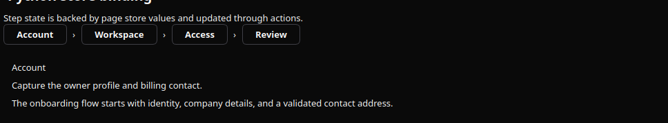
"title": "Account",
"description": "Capture the owner profile and billing contact.",
"content": "The onboarding flow starts with identity, company details, and a validated contact address.",
},
{
"id": "workspace",
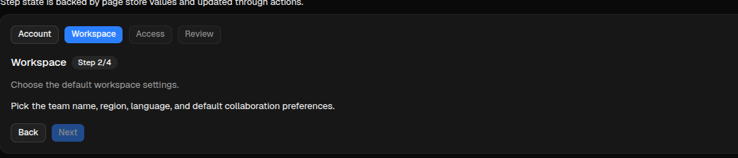
"title": "Workspace",
"description": "Choose the default workspace settings.",
"content": "Pick the team name, region, language, and default collaboration preferences.",
},
{
"id": "access",
"title": "Access",
"description": "Invite team members and assign initial roles.",
"content": "Review administrator access, reviewer seats, and audit visibility before launch.",
},
{
"id": "review",
"title": "Review",
"description": "Confirm the configuration before activation.",
"content": "The final step summarizes all choices and keeps launch locked until earlier steps are validated.",
},
]
wizard = sdk.ui.Wizard(
"wizard_inline",
steps=steps,
active_step_id="profile",
validated_steps=[],
action="components.test_wizard_dispatch",
params={"wizard_id": "wizard_inline", "target_wizard": "wizard_inline"},
allow_step_click=True,
show_controls=True,
prev_label="Back",
next_label="Next",
)
wizard.set_required_permissions(["components.navigation.view"])- kind: Wizard
id: wizard_inline
steps:
- id: profile
title: Account
description: Capture the owner profile and billing contact.
content: The onboarding flow starts with identity, company details, and a validated contact address.
- id: workspace
title: Workspace
description: Choose the default workspace settings.
content: Pick the team name, region, language, and default collaboration preferences.
- id: access
title: Access
description: Invite team members and assign initial roles.
content: Review administrator access, reviewer seats, and audit visibility before launch.
- id: review
title: Review
description: Confirm the configuration before activation.
content: The final step summarizes all choices and keeps launch locked until earlier steps are validated.
active_step_id: profile
validated_steps: []
action: components.test_wizard_dispatch
params: {wizard_id: wizard_inline, target_wizard: wizard_inline}
allow_step_click: true
show_controls: true
prev_label: Back
next_label: Next
required_permissions: [components.navigation.view]Runtime Updates
Use literal/YAML values to seed steps, active_step_id, and validated_steps. For runtime navigation, update the Wizard directly. Store/data bindings are not the recommended runtime state channel for active_step_id and validated_steps, because the Wizard combines interaction state, validation gates, and internal controls.
live_wizard = sdk.ui.Wizard(
    "wizard_live",
    steps=steps,
    active_step_id="profile",
    validated_steps=[],
    action="components.test_wizard_dispatch",
    params={"target_wizard": "wizard_live"},
)
live_wizard.allow("steps.set", "active_step_id.set", "validated_steps.set")
- kind: Wizard
id: wizard_live
steps:
- id: profile
title: Account
description: Capture the owner profile and billing contact.
- id: workspace
title: Workspace
description: Choose the default workspace settings.
active_step_id: profile
validated_steps: []
action: components.test_wizard_dispatch
params: {target_wizard: wizard_live}
capabilities: [steps.set, active_step_id.set, validated_steps.set]Runtime actions read the current component state from the client, then write the next state directly:
surface_id = ctx["_surface_id"]
stream_id = ctx["_stream_id"]
wizard_id = ctx["target_wizard"]

props = await sdk.effects.ask_current_component_props(
    stream_id,
    wizard_id,
    surface_id=surface_id,
)
steps = props["steps"]
validated_steps = [*props["validated_steps"], props["active_step_id"]]

return sdk.effects.respond(
    sdk.effects.ui_property_update(wizard_id, "steps", steps, surface_id=surface_id),
    sdk.effects.ui_property_update(wizard_id, "active_step_id", "workspace", surface_id=surface_id),
    sdk.effects.ui_property_update(wizard_id, "validated_steps", validated_steps, surface_id=surface_id),
)
Mutable Capabilities
Wizard has no mutable capabilities by default. Add only the capabilities needed by the actions that update it.
| Capability | Effect |
|---|---|
steps.set |
Replaces the full step list. |
steps.append |
Appends a step definition. |
steps.remove |
Removes a step definition. |
steps.replace |
Replaces a step definition. |
active_step_id.set |
Changes the active step. |
validated_steps.set |
Replaces the validated step id list. |
allow_step_click.set |
Enables or disables clickable step headers. |
show_controls.set |
Shows or hides previous/next controls. |
prev_label.set |
Replaces the previous button label. |
next_label.set |
Replaces the next button label. |
Visibility and Permissions
Wizard supports common visibility and permission properties. Use real bindings when actions must toggle visibility at runtime.
wizard.set_show_if({
    "conditions": [
        {
            "left": bound.store("/components_test/wizard/show", scope="page", default=True),
            "op": "==",
            "right": True,
        }
    ]
})
wizard.set_hide_if({
    "conditions": [
        {
            "left": bound.store("/components_test/wizard/hide", scope="page", default=False),
            "op": "==",
            "right": True,
        }
    ]
})
wizard.set_required_permissions(["components.navigation.view"])
- kind: Wizard
id: wizard_guarded
steps: []
required_permissions: [components.navigation.view]
show_if:
conditions:
- left: {type: store, scope: page, path: /components_test/wizard/show, default: true}
op: "=="
right: true
hide_if:
conditions:
- left: {type: store, scope: page, path: /components_test/wizard/hide, default: false}
op: "=="
right: trueAction Confirmation
Use action.confirm to ask for confirmation before a wizard control dispatches its action. Confirmation text should use translation keys.
wizard = sdk.ui.Wizard(
    "wizard_confirm",
    steps=steps,
    active_step_id="profile",
    validated_steps=["profile"],
    action={
        "name": "components.wizard_confirm_action",
        "context": {"source": "python_wizard"},
        "confirm": {
            "text": sdk.i18n.t("components.wizard.confirm.prompt"),
            "confirm_text": sdk.i18n.t("components.wizard.confirm.accept"),
            "cancel_text": sdk.i18n.t("components.wizard.confirm.cancel"),
        },
    },
    params={"wizard_id": "wizard_confirm"},
)
- kind: Wizard
id: wizard_confirm
steps:
- id: profile
title: Profile
- id: review
title: Review
active_step_id: profile
validated_steps: [profile]
action:
name: components.wizard_confirm_action
context:
source: yaml_wizard
confirm:
text: "@t/components.wizard.confirm.prompt"
confirm_text: "@t/components.wizard.confirm.accept"
cancel_text: "@t/components.wizard.confirm.cancel"
params:
wizard_id: wizard_confirmScreenshots
Desktop preview:
Web preview: