Purpose
Accordion renders a group of expandable items. Use it when a page needs several related sections but only part of the content should be open at a time.
The component is client-interactive: clicking an item trigger opens or closes its panel. With multiple=False, opening one panel closes the others. With multiple=True, more than one panel can remain open. With collapsible=False, the web renderer keeps a single accordion from collapsing to no open item.
Constructor
Accordion(
    id: str,
    items: Optional[List[Dict[str, Any]]] = None,
    multiple: bool = False,
    collapsible: bool = True,
)
Properties
| Property | Type | Default | Description |
|---|---|---|---|
items |
list[dict] |
[] |
Item list rendered in order. Each item supports title, content, open; the desktop renderer also renders meta when present. |
multiple |
bool |
False |
Allows more than one item to stay open. |
collapsible |
bool |
True |
Allows a single web accordion item to be collapsed after it is open. |
children |
inherited list | [] |
Optional child content rendered into item panels in item order. |
Examples
from democrai.sdk.client import active_sdk as sdk
from democrai.sdk.ui import bound
items = [
{
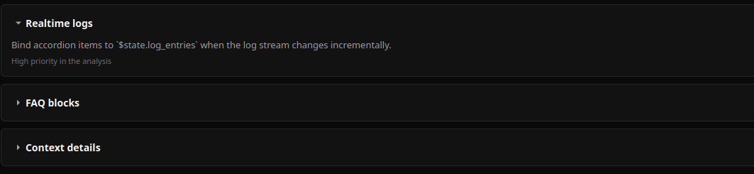
"title": "Realtime logs",
"content": "Open by default and updated from runtime state.",
"meta": "High priority",
"open": True,
},
{
"title": "Audit notes",
"content": "Collapsed until the user opens it.",
"open": False,
},
]
builder.add(sdk.ui.Text("accordion_child", "Rendered child content"))
accordion = sdk.ui.Accordion(
"accordion_static",
items=items,
multiple=False,
collapsible=True,
)
accordion.set_required_permissions(["components.complex.view"])
accordion.set_show_if({
"conditions": [
{
"left": bound.store("/components_test/accordion/show", scope="page", default=True),
"op": "==",
"right": True,
}
]
})
accordion.set_hide_if({
"conditions": [
{
"left": bound.store("/components_test/accordion/hide", scope="page", default=False),
"op": "==",
"right": True,
}
]
})
accordion.children.append("accordion_child")
accordion.allow("items.set", "multiple.set", "collapsible.set")- kind: Text
id: accordion_child
text: "Rendered child content"
- kind: Accordion
id: accordion_static
items:
- title: "Realtime logs"
content: "Open by default and updated from runtime state."
meta: "High priority"
open: true
- title: "Audit notes"
content: "Collapsed until the user opens it."
open: false
multiple: false
collapsible: true
required_permissions: [components.complex.view]
show_if:
conditions:
- left: {type: store, scope: page, path: /components_test/accordion/show, default: true}
op: "=="
right: true
hide_if:
conditions:
- left: {type: store, scope: page, path: /components_test/accordion/hide, default: false}
op: "=="
right: true
capabilities: [items.set, multiple.set, collapsible.set]
children:
- accordion_childBinding and Updates
items, multiple, and collapsible can be supplied as normal properties in Python and YAML. The demo also includes store-bound and data-model-bound versions of the accordion.
store_bound = sdk.ui.Accordion(
    "accordion_store",
    items=bound.store("/components_test/accordion/items", scope="page", default=items),
    multiple=bound.store("/components_test/accordion/multiple", scope="page", default=False),
    collapsible=bound.store("/components_test/accordion/collapsible", scope="page", default=True),
)

data_bound = sdk.ui.Accordion(
    "accordion_data",
    items=bound.data("/components_test/accordion_model/items", default=items),
    multiple=bound.data("/components_test/accordion_model/multiple", default=False),
    collapsible=bound.data("/components_test/accordion_model/collapsible", default=True),
)

live = sdk.ui.Accordion("accordion_live", items=items, multiple=False, collapsible=True)
live.allow("items.set", "multiple.set", "collapsible.set")
- kind: Accordion
id: accordion_store
items: {type: store, scope: page, path: /components_test/accordion/items, default: []}
multiple: {type: store, scope: page, path: /components_test/accordion/multiple, default: false}
collapsible: {type: store, scope: page, path: /components_test/accordion/collapsible, default: true}
- kind: Accordion
id: accordion_data
items: "@data/components_test/accordion_model/items"
multiple: "@data/components_test/accordion_model/multiple"
collapsible: "@data/components_test/accordion_model/collapsible"
- kind: Accordion
id: accordion_live
items: []
multiple: false
collapsible: true
capabilities: [items.set, multiple.set, collapsible.set]Runtime updates must target the current surface:
surface_id = ctx["_surface_id"]

return sdk.effects.respond(
    sdk.effects.ui_messages([
        {
            "stateUpdate": {
                "scope": "page",
                "values": {
                    "/components_test/accordion/items": next_items,
                    "/components_test/accordion/multiple": True,
                    "/components_test/accordion/collapsible": False,
                },
            }
        },
        sdk.ui.Builder.build_data_model_update_payload(
            surface_id=surface_id,
            data={
                "components_test": {
                    "accordion_model": {
                        "items": next_items,
                        "multiple": True,
                        "collapsible": False,
                    }
                }
            },
        ),
    ]),
    sdk.effects.ui_property_update("accordion_live", "items", next_items, surface_id=surface_id),
    sdk.effects.ui_property_update("accordion_live", "multiple", True, surface_id=surface_id),
    sdk.effects.ui_property_update("accordion_live", "collapsible", False, surface_id=surface_id),
)
Renderer Notes
Desktop renders items[].title, items[].content, items[].open, and optional items[].meta. Desktop binding strategies are declared for items and multiple.
Web renders the same item fields and applies collapsible through the shadcn accordion primitive. Web also renders child content into item panels by index.
Screenshots
Desktop:
Web: