Purpose
Calendar renders an event calendar with month, week, and day views. It displays dated events, highlights selected days or time slots, can expose custom selection buttons, emits calendar interaction intents through its primary action, and can emit an event-click action with the clicked event payload.
Use it for schedule, agenda, booking, and planning surfaces where events are supplied by the module. The component does not fetch events by itself and does not persist user selections automatically; actions must return store, data model, or property updates when the selection or event list must be synchronized.
Constructor
Calendar(
    id: str,
    value: str = "",
    min_date: str = "",
    max_date: str = "",
    max_width: int | None = None,
    action: str | ActionSpec | None = None,
    params: dict | None = None,
    *,
    label: str = "",
    date_format: str = "yyyy-MM-dd",
    input_mask: str = "",
    show_input: bool = True,
    events: list | None = None,
    view: str = "month",
    current_date: str = "",
    selected_dates: list | None = None,
    selected_slots: list | None = None,
    buttons: list | None = None,
    on_event_click: str | ActionSpec | None = None,
    on_event_click_params: dict | None = None,
    time_from: int = 0,
    time_to: int = 24,
)
Properties
| Python argument | Payload/YAML property | Type | Default | Description |
|---|---|---|---|---|
label |
label |
str |
"" |
Optional field label. The desktop renderer displays it in the field shell. |
value |
value |
str |
"" |
Legacy selected-date value. The desktop event calendar can use it as the initial date when current_date is empty. |
min_date |
min_date |
str |
"" |
Serialized legacy date-picker bound. It is not enforced by the current event-calendar renderers. |
max_date |
max_date |
str |
"" |
Serialized legacy date-picker bound. It is not enforced by the current event-calendar renderers. |
max_width |
max_width |
int \| null |
null |
Optional field-shell width limit where supported by the renderer shell. |
date_format |
date_format |
str |
"yyyy-MM-dd" |
Serialized legacy date-picker format. Event dates should still be supplied as ISO yyyy-MM-dd. |
input_mask |
input_mask |
str |
"" |
Serialized legacy date-picker mask. It is not used by the event-calendar grid. |
show_input |
show_input |
bool |
true |
Serialized legacy date-picker flag. It is not used by the event-calendar grid. |
events |
events |
list[dict] |
[] |
Events rendered in the month, week, and day views. |
view |
view |
str |
"month" |
Initial view. Supported values are "month", "week", and "day". Unknown values fall back to month in the desktop renderer. |
current_date |
current_date |
str |
"" |
ISO date used as the visible month, week, or day anchor. |
selected_dates |
selected_dates |
list[str] |
[] |
Selected ISO dates for month view. The UI treats month selection as single-day selection. |
selected_slots |
selected_slots |
list |
[] |
Selected time slots. Week view uses objects with date and time; day view uses HH:MM strings. |
buttons |
buttons |
list[dict] |
[] |
Custom buttons displayed in the selection bar when there is a selected day or slot. |
action |
action |
action spec | null |
Primary interaction action for navigation, view changes, day clicks, slot clicks, and desktop create-event requests. |
params |
action.context |
dict |
{} |
Context merged into the primary action payload. |
on_event_click |
on_event_click |
action spec | null |
Action emitted when an event item is clicked. |
on_event_click_params |
on_event_click.context |
dict |
{} |
Context merged into the event-click action payload. |
time_from |
time_from |
int |
0 |
First hour shown in week/day time grids, clamped to 0. |
time_to |
time_to |
int |
24 |
End hour for week/day time grids, clamped to 24. |
For direct property updates and YAML definitions, use the payload property names.
Action Confirmation
Use confirm inside the ActionSpec for the primary action, on_event_click, or any custom buttons[].action. Confirmation text should use translation keys.
Primary calendar interactions confirm before changing local calendar state. If the user cancels a primary action confirmation, the view, visible date, selected day, or selected slot remains unchanged.
calendar = sdk.ui.Calendar(
    "calendar_confirm",
    events=[
        {
            "_id": "event_alpha",
            "date": "2026-04-29",
            "time": "09:00",
            "title": "Confirmable event",
        }
    ],
    view="month",
    current_date="2026-04-29",
    action={
        "name": "components.calendar_confirm_action",
        "context": {"source": "python_calendar_primary"},
        "confirm": {
            "text": sdk.i18n.t("components.calendar.confirm.primary_prompt"),
            "confirm_text": sdk.i18n.t("components.calendar.confirm.accept"),
            "cancel_text": sdk.i18n.t("components.calendar.confirm.cancel"),
        },
    },
    on_event_click={
        "name": "components.calendar_confirm_action",
        "context": {"source": "python_calendar_event"},
        "confirm": {
            "text": sdk.i18n.t("components.calendar.confirm.event_prompt"),
            "confirm_text": sdk.i18n.t("components.calendar.confirm.accept"),
            "cancel_text": sdk.i18n.t("components.calendar.confirm.cancel"),
        },
    },
    buttons=[
        {
            "label": sdk.i18n.t("components.calendar.confirm.button_label"),
            "variant": "primary",
            "action": {
                "name": "components.calendar_confirm_action",
                "context": {"source": "python_calendar_button"},
                "confirm": {
                    "text": sdk.i18n.t("components.calendar.confirm.button_prompt"),
                    "confirm_text": sdk.i18n.t("components.calendar.confirm.accept"),
                    "cancel_text": sdk.i18n.t("components.calendar.confirm.cancel"),
                },
            },
        }
    ],
)
- kind: Calendar
id: calendar_confirm
view: month
current_date: "2026-04-29"
events:
- _id: event_alpha
date: "2026-04-29"
time: "09:00"
title: Confirmable event
action:
name: components.calendar_confirm_action
context:
source: yaml_calendar_primary
confirm:
text: "@t/components.calendar.confirm.primary_prompt"
confirm_text: "@t/components.calendar.confirm.accept"
cancel_text: "@t/components.calendar.confirm.cancel"
on_event_click:
name: components.calendar_confirm_action
context:
source: yaml_calendar_event
confirm:
text: "@t/components.calendar.confirm.event_prompt"
confirm_text: "@t/components.calendar.confirm.accept"
cancel_text: "@t/components.calendar.confirm.cancel"
buttons:
- label: "@t/components.calendar.confirm.button_label"
variant: primary
action:
name: components.calendar_confirm_action
context:
source: yaml_calendar_button
confirm:
text: "@t/components.calendar.confirm.button_prompt"
confirm_text: "@t/components.calendar.confirm.accept"
cancel_text: "@t/components.calendar.confirm.cancel"Event Shape
| Field | Type | Description |
|---|---|---|
_id |
str |
Optional stable id used by module actions. The renderer does not require it. |
date |
str |
ISO date (yyyy-MM-dd). Used to place the event on the calendar. |
start |
str |
Optional ISO datetime fallback used by renderers when date is missing. |
time |
str |
Time label such as 09:00. Week view groups by hour; day view places events into 30-minute buckets. |
title |
str |
Display text for the event. |
duration |
int |
Duration in minutes. Day view uses it to span event blocks. |
description |
str |
Optional detail shown in day view and available to event-click actions. |
color |
str |
Optional CSS/Qt color used for the event marker or block. |
Selection Shapes
| View | Property | Shape |
|---|---|---|
| Month | selected_dates |
["2026-03-18"] |
| Week | selected_slots |
[{"date": "2026-03-23", "time": "09:00"}] |
| Day | selected_slots |
["09:30", "10:00"] |
Week selection is same-day multi-select in the renderers. Selecting a slot on another day clears the previous week selection.
Mutable Capabilities
Calendar exposes these mutable capabilities by default:
| Property | Capabilities |
|---|---|
value |
value.set, value.append |
events |
events.set, events.append, events.remove, events.replace |
selected_dates |
selected_dates.set, selected_dates.append, selected_dates.remove |
selected_slots |
selected_slots.set, selected_slots.append, selected_slots.remove |
| visibility state | visible.set, enabled.set |
Direct updates to other rendered properties, such as label, view, current_date, buttons, time_from, or time_to, must be declared explicitly with allow(...) or YAML capabilities.
Calendar Example
from democrai.sdk.client import active_sdk as sdk
from democrai.sdk.ui import bound

events = [
    {
        "_id": "cal_evt_standup",
        "date": "2026-03-05",
        "time": "09:00",
        "title": "Team standup",
        "duration": 30,
        "description": "Daily project sync.",
        "color": "#2563eb",
    },
    {
        "_id": "cal_evt_review",
        "date": "2026-03-18",
        "time": "11:00",
        "title": "Board review",
        "duration": 120,
        "description": "Quarterly planning session.",
        "color": "#7c3aed",
    },
]

buttons = [
    {"label": "Add event", "action": "components.calendar_test_button", "params": {"source": "selection"}, "variant": "primary"},
    {"label": "Inspect", "action": "components.calendar_test_button", "params": {"source": "inspect"}, "variant": "default"},
]

calendar = sdk.ui.Calendar(
    "calendar_static",
    label="Planning calendar",
    value="2026-03-01",
    min_date="2026-03-01",
    max_date="2026-04-30",
    max_width=None,
    date_format="yyyy-MM-dd",
    input_mask="0000-00-00",
    show_input=True,
    view="month",
    current_date="2026-03-01",
    events=events,
    selected_dates=["2026-03-18"],
    selected_slots=[],
    buttons=buttons,
    action="components.calendar_test_interaction",
    params={"source": "calendar_static"},
    on_event_click="components.calendar_test_event_click",
    on_event_click_params={"source": "calendar_static"},
    time_from=8,
    time_to=18,
)
calendar.set_show_if({
    "conditions": [
        {
            "left": bound.store("/components_test/calendar/show", scope="page", default=True),
            "op": "==",
            "right": True,
        }
    ]
})
calendar.set_hide_if({
    "conditions": [
        {
            "left": bound.store("/components_test/calendar/hide", scope="page", default=False),
            "op": "==",
            "right": True,
        }
    ]
})
calendar.set_required_permissions(["components.complex.view"])
calendar.allow("label.set", "value.set", "current_date.set", "view.set", "events.set", "selected_dates.set", "selected_slots.set", "buttons.set", "time_from.set", "time_to.set")
- kind: Calendar
id: calendar_static
label: Planning calendar
value: "2026-03-01"
min_date: "2026-03-01"
max_date: "2026-04-30"
max_width: null
date_format: yyyy-MM-dd
input_mask: "0000-00-00"
show_input: true
view: month
current_date: "2026-03-01"
action: components.calendar_test_interaction
params: {source: calendar_static}
on_event_click: components.calendar_test_event_click
on_event_click_params: {source: calendar_static}
time_from: 8
time_to: 18
events:
- _id: cal_evt_standup
date: "2026-03-05"
time: "09:00"
title: Team standup
duration: 30
description: Daily project sync.
color: "#2563eb"
- _id: cal_evt_review
date: "2026-03-18"
time: "11:00"
title: Board review
duration: 120
description: Quarterly planning session.
color: "#7c3aed"
selected_dates: ["2026-03-18"]
selected_slots: []
buttons:
- label: Add event
action: components.calendar_test_button
params: {source: selection}
variant: primary
- label: Inspect
action: components.calendar_test_button
params: {source: inspect}
variant: default
required_permissions: [components.complex.view]
show_if:
conditions:
- left: {type: store, scope: page, path: /components_test/calendar/show, default: true}
op: "=="
right: true
hide_if:
conditions:
- left: {type: store, scope: page, path: /components_test/calendar/hide, default: false}
op: "=="
right: true
capabilities: [label.set, value.set, current_date.set, view.set, events.set, selected_dates.set, selected_slots.set, buttons.set, time_from.set, time_to.set]Bindings and Updates
Store-bound and data-model-bound examples use the same event-calendar state as the static calendar. In Python, use bound.store(...) for page/global store and bound.data(...) for the surface data model. In YAML, use explicit store binding objects and @data/... paths.
Static calendars keep their initial view, current_date, events, and selection. Use store bindings, data-model bindings, or direct property updates when an external control must switch the visible month or replace the event list.
store_calendar = sdk.ui.Calendar("calendar_store", buttons=buttons)
store_calendar.set_property("label", bound.store("/components_test/calendar/label", scope="page", default="Planning calendar"))
store_calendar.set_property("view", bound.store("/components_test/calendar/view", scope="page", default="month"))
store_calendar.set_property("current_date", bound.store("/components_test/calendar/current_date", scope="page", default="2026-03-01"))
store_calendar.set_property("events", bound.store("/components_test/calendar/events", scope="page", default=events))
store_calendar.set_property("selected_dates", bound.store("/components_test/calendar/selected_dates", scope="page", default=["2026-03-18"]))
store_calendar.set_property("selected_slots", bound.store("/components_test/calendar/selected_slots", scope="page", default=[]))

data_calendar = sdk.ui.Calendar("calendar_data", buttons=buttons)
data_calendar.set_property("label", bound.data("/components_test/calendar_model/label", default="Planning calendar"))
data_calendar.set_property("view", bound.data("/components_test/calendar_model/view", default="month"))
data_calendar.set_property("current_date", bound.data("/components_test/calendar_model/current_date", default="2026-03-01"))
data_calendar.set_property("events", bound.data("/components_test/calendar_model/events", default=events))
data_calendar.set_property("selected_dates", bound.data("/components_test/calendar_model/selected_dates", default=["2026-03-18"]))
data_calendar.set_property("selected_slots", bound.data("/components_test/calendar_model/selected_slots", default=[]))

live_calendar = sdk.ui.Calendar("calendar_live", label="Planning calendar", events=events)
live_calendar.allow("label.set", "value.set", "current_date.set", "view.set", "events.set", "selected_dates.set", "selected_slots.set", "buttons.set", "time_from.set", "time_to.set")
- kind: Calendar
id: calendar_store
label: Planning calendar
view: {type: store, scope: page, path: /components_test/calendar/view, default: month}
current_date: {type: store, scope: page, path: /components_test/calendar/current_date, default: "2026-03-01"}
events: {type: store, scope: page, path: /components_test/calendar/events, default: []}
selected_dates: {type: store, scope: page, path: /components_test/calendar/selected_dates, default: ["2026-03-18"]}
selected_slots: {type: store, scope: page, path: /components_test/calendar/selected_slots, default: []}
buttons: []
- kind: Calendar
id: calendar_data
label: Planning calendar
view: "@data/components_test/calendar_model/view"
current_date: "@data/components_test/calendar_model/current_date"
events: "@data/components_test/calendar_model/events"
selected_dates: "@data/components_test/calendar_model/selected_dates"
selected_slots: "@data/components_test/calendar_model/selected_slots"
buttons: []
- kind: Calendar
id: calendar_live
label: Planning calendar
events: []
capabilities: [label.set, value.set, current_date.set, view.set, events.set, selected_dates.set, selected_slots.set, buttons.set, time_from.set, time_to.set]Runtime updates must target the current surface:
surface_id = ctx["_surface_id"]

return sdk.effects.respond(
    sdk.effects.ui_messages([
        {
            "stateUpdate": {
                "scope": "page",
                "values": {
                    "/components_test/calendar/label": next_label,
                    "/components_test/calendar/current_date": next_date,
                    "/components_test/calendar/view": next_view,
                    "/components_test/calendar/events": next_events,
                    "/components_test/calendar/selected_dates": next_selected_dates,
                    "/components_test/calendar/selected_slots": next_selected_slots,
                },
            }
        },
        sdk.ui.Builder.build_data_model_update_payload(
            surface_id=surface_id,
            data={
                "components_test": {
                    "calendar_model": {
                        "label": next_label,
                        "current_date": next_date,
                        "view": next_view,
                        "events": next_events,
                        "selected_dates": next_selected_dates,
                        "selected_slots": next_selected_slots,
                    }
                }
            },
        ),
    ]),
    sdk.effects.ui_property_update("calendar_live", "label", next_label, surface_id=surface_id),
    sdk.effects.ui_property_update("calendar_live", "current_date", next_date, surface_id=surface_id),
    sdk.effects.ui_property_update("calendar_live", "view", next_view, surface_id=surface_id),
    sdk.effects.ui_property_update("calendar_live", "events", next_events, surface_id=surface_id),
    sdk.effects.ui_property_update("calendar_live", "selected_dates", next_selected_dates, surface_id=surface_id),
    sdk.effects.ui_property_update("calendar_live", "selected_slots", next_selected_slots, surface_id=surface_id),
)
Interactions
on_event_click is the only dedicated event callback property. It receives the clicked event plus date, time, and title.
The component does not define separate on_day_click, on_hour_click, on_month_change, on_day_change, or on_week_change properties. Use the primary action property for renderer interaction intents.
Custom buttons are shown in the selection bar. The renderer merges each button params with the current selection context:
| Active view | Button context |
|---|---|
| Month | date |
| Week | date, time, slots as [{date, time}] |
| Day | date, time, slots as ["HH:MM"] |
The renderers emit these primary action intents:
| Intent | Clients | When it is emitted | Payload fields |
|---|---|---|---|
navigate |
Desktop, web | Previous/next navigation in month, week, or day view | view, direction, date |
view_change |
Desktop, web | View tab changes or switching from a month day to day view | view, optional date |
day_click |
Desktop, web | Day selection in month view | view, date |
slot_click |
Desktop, web | Time-slot selection in week or day view | view, date, time |
create_event_request |
Desktop | Context-menu create request in month view | view, date, time |
create_event_request is emitted by the desktop context menu. On web, use a custom buttons entry such as Add event for the same user flow after a day or slot is selected.
The test page binds every calendar primary action to components.calendar_test_interaction. The action can branch on intent:
@action("calendar_test_interaction")
async def calendar_test_interaction(ctx, session, sdk):
    intent = ctx.get("intent")
    if intent == "navigate":
        view = ctx["view"]
        date = ctx["date"]
    elif intent == "view_change":
        view = ctx["view"]
        date = ctx.get("date")
    elif intent == "day_click":
        date = ctx["date"]
    elif intent == "slot_click":
        date = ctx["date"]
        time = ctx["time"]
    elif intent == "create_event_request":
        date = ctx["date"]
        time = ctx["time"]
Interaction examples reproduced by the test page:
| Interaction | Demo trigger | Example payload |
|---|---|---|
| Month change | Click previous/next while view is month |
{"intent": "navigate", "view": "month", "direction": 1, "date": "2026-04-01"} |
| Week change | Click previous/next while view is week |
{"intent": "navigate", "view": "week", "direction": 1, "date": "2026-03-30"} |
| Day change | Click previous/next while view is day |
{"intent": "navigate", "view": "day", "direction": 1, "date": "2026-03-24"} |
| View change | Click the month, week, or day tab | {"intent": "view_change", "view": "week"} |
| Month day click | Click a day cell in month view | {"intent": "day_click", "view": "month", "date": "2026-03-18"} |
| Week hour click | Click a time slot in week view | {"intent": "slot_click", "view": "week", "date": "2026-03-23", "time": "09:00"} |
| Day hour click | Click a time slot in day view | {"intent": "slot_click", "view": "day", "date": "2026-03-23", "time": "09:30"} |
| Event click | Click an event item | {"event": {...}, "date": "2026-03-18", "time": "11:00", "title": "Board review"} |
| Add event button | Select a day or slot, then click Add event |
{"source": "selection", "date": "2026-03-18", "time": "11:00", "slots": [...]} |
| Desktop create request | Right-click a month day and choose Add event here |
{"intent": "create_event_request", "view": "month", "date": "2026-03-18", "time": "09:00"} |
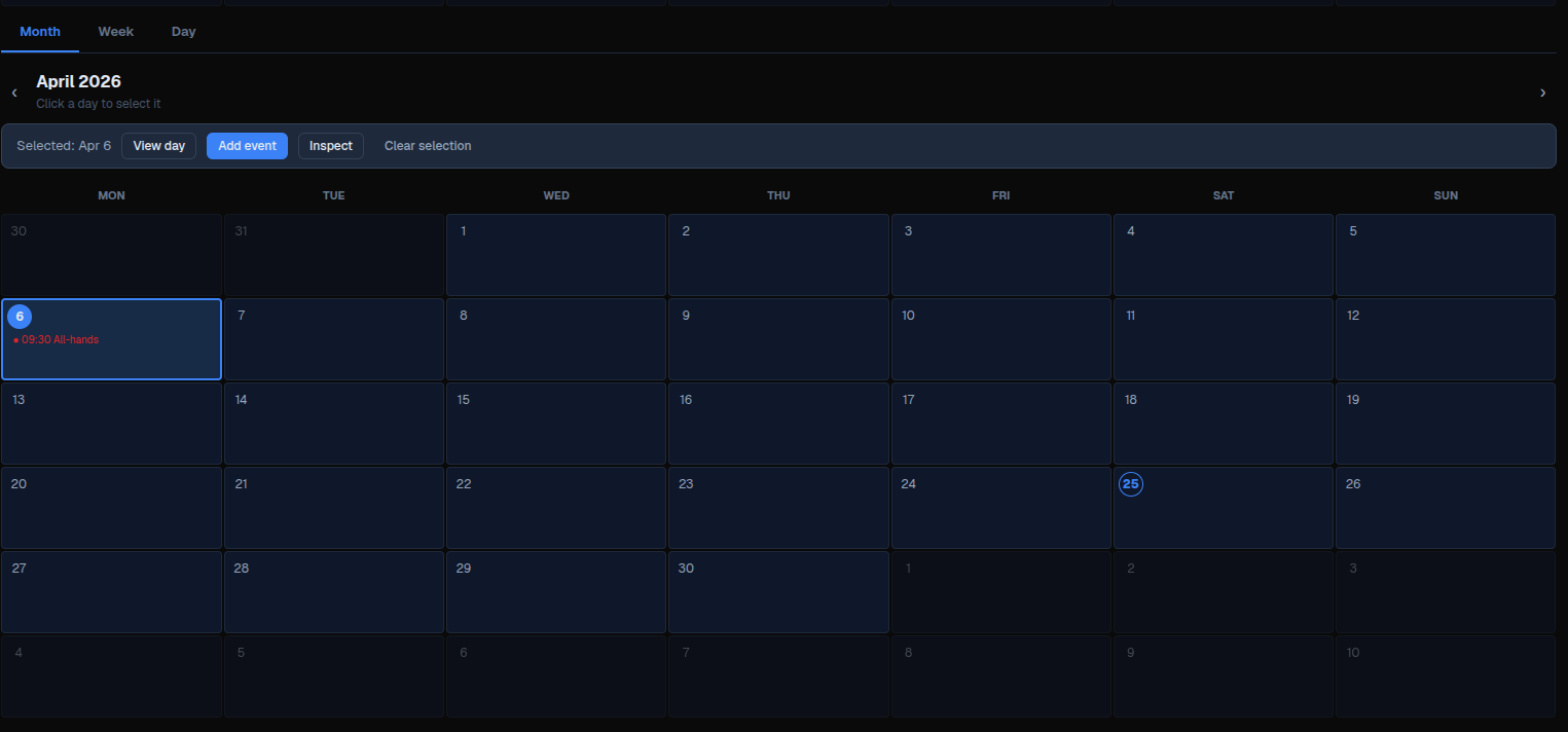
Screenshots
Desktop:
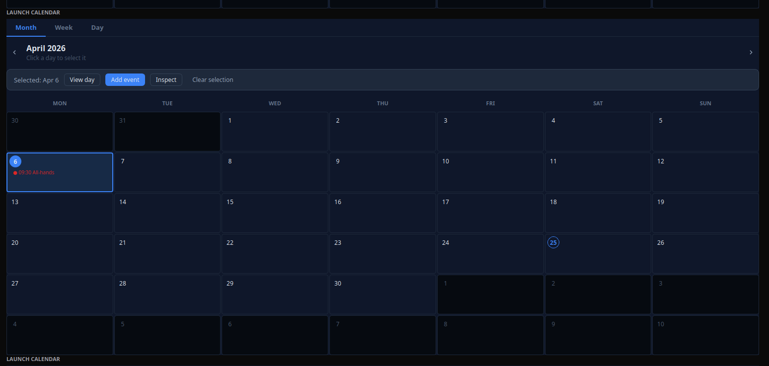
Web: