Purpose
Carousel renders a sequence of data items as slides. Each slide is produced from the same item_template, with {{field}} placeholders resolved against the current item.
Use it when the UI must show a small set of featured records, summaries, cards, or actionable items one at a time while still keeping the data source bindable and replaceable at runtime.
Constructor
Carousel(
    id: str,
    data_source: dict,
    item_template: Component,
    on_item_click: dict | None = None,
    on_change: dict | None = None,
    active_index: int = 0,
    autoplay: bool = False,
    interval_ms: int = 3000,
    show_dots: bool = True,
    show_arrows: bool = True,
    loop: bool = True,
)
Properties
| Property | Type | Default | Description |
|---|---|---|---|
dataSource |
dict |
required | Slide data source. Supports inline data and binding data. |
itemTemplate |
Component |
required | Component tree rendered for each item. {{field}} placeholders are resolved from the slide item. |
onItemClick |
dict |
None |
Action spec emitted when a slide is clicked. |
onChange |
dict |
None |
Action spec emitted when navigation changes the active slide. |
activeIndex |
int |
0 |
Initially active slide index. Values below zero are normalized to 0. |
autoplay |
bool |
false |
Advances slides automatically when more than one slide exists. |
intervalMs |
int |
3000 |
Autoplay interval in milliseconds. Values below 300 are normalized to 300. |
showDots |
bool |
true |
Shows numbered dot controls when more than one slide exists. |
showArrows |
bool |
true |
Shows previous/next arrow controls when more than one slide exists. |
loop |
bool |
true |
Allows navigation to wrap around at the first and last slide. |
Python constructor arguments use snake_case. YAML component definitions also use constructor keys such as data_source, item_template, active_index, interval_ms, show_dots, and show_arrows. Runtime property updates target the serialized property names such as dataSource, activeIndex, and intervalMs.
Action Confirmation
onItemClick and onChange action specs can include confirm. If the user cancels the dialog, no backend action is sent.
template = sdk.ui.Card(
    "confirm_carousel_template",
    [
        sdk.ui.Text("confirm_carousel_title", "{{title}}"),
        sdk.ui.Text("confirm_carousel_body", "{{body}}"),
    ],
    variant="outlined",
)

carousel = sdk.ui.Carousel(
    "confirm_python_carousel",
    data_source={
        "type": "inline",
        "data": [
            {"id": "slide_alpha", "title": "Alpha slide", "body": "First carousel item."},
            {"id": "slide_beta", "title": "Beta slide", "body": "Second carousel item."},
        ],
    },
    item_template=template,
    on_item_click={
        "name": "components.carousel_confirm_action",
        "context": {"source": "python_carousel_click"},
        "confirm": {
            "text": sdk.i18n.t("components.carousel.confirm.click_prompt"),
            "confirm_text": sdk.i18n.t("components.carousel.confirm.accept"),
            "cancel_text": sdk.i18n.t("components.carousel.confirm.cancel"),
        },
    },
    on_change={
        "name": "components.carousel_confirm_action",
        "context": {"source": "python_carousel_change"},
        "confirm": {
            "text": sdk.i18n.t("components.carousel.confirm.change_prompt"),
            "confirm_text": sdk.i18n.t("components.carousel.confirm.accept"),
            "cancel_text": sdk.i18n.t("components.carousel.confirm.cancel"),
        },
    },
)
- kind: Carousel
id: confirm_yaml_carousel
data_source:
type: inline
data:
- id: slide_alpha
title: Alpha slide
body: First carousel item.
- id: slide_beta
title: Beta slide
body: Second carousel item.
item_template:
kind: Card
id: confirm_carousel_template
variant: outlined
children:
- kind: Text
id: confirm_carousel_title
text: "{{title}}"
- kind: Text
id: confirm_carousel_body
text: "{{body}}"
on_item_click:
name: components.carousel_confirm_action
context:
source: yaml_carousel_click
confirm:
text: "@t/components.carousel.confirm.click_prompt"
confirm_text: "@t/components.carousel.confirm.accept"
cancel_text: "@t/components.carousel.confirm.cancel"
on_change:
name: components.carousel_confirm_action
context:
source: yaml_carousel_change
confirm:
text: "@t/components.carousel.confirm.change_prompt"
confirm_text: "@t/components.carousel.confirm.accept"
cancel_text: "@t/components.carousel.confirm.cancel"Data Source
Inline data passes the slide items directly:
{"type": "inline", "data": [{"id": "slide_runtime", "title": "Runtime"}]}Binding data resolves the data field from page/global store or from the surface data model:
{"type": "binding", "data": bound.store("/components_test/carousel/slides", scope="page", default=[])}
{"type": "binding", "data": bound.data("/components_test/carousel_model/slides", default=[])}
In YAML, store bindings use the explicit binding object, while data-model bindings can use an @data/... path.
Template and Actions
item_template is a normal component tree. Every slide receives a copy of that tree, with item fields available through {{...}} placeholders:
template = sdk.ui.Card("carousel_template_card", [
sdk.ui.Column("carousel_template_body", [
sdk.ui.Text("carousel_template_eyebrow", "{{eyebrow}}"),
sdk.ui.Title("carousel_template_title", "{{title}}", level=3),
sdk.ui.Text("carousel_template_desc", "{{desc}}"),
sdk.ui.Button("carousel_template_cta", "{{cta}}", variant="default", btnsize="sm"),
])
], variant="outlined")
carousel = sdk.ui.Carousel(
"carousel_inline",
data_source={"type": "inline", "data": [
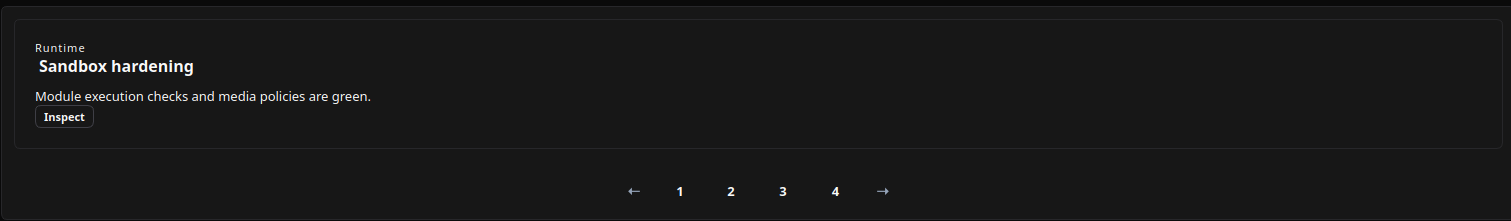
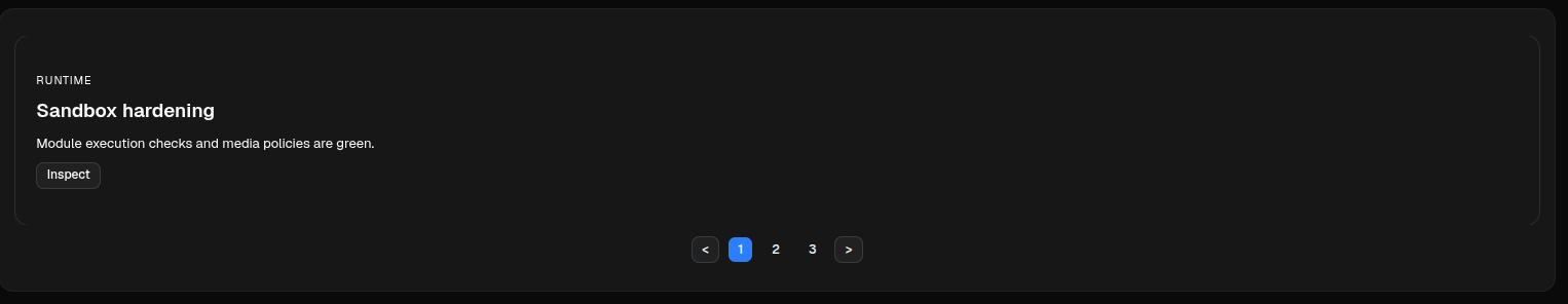
{"id": "slide_runtime", "eyebrow": "Runtime", "title": "Sandbox hardening", "desc": "Module execution checks are green.", "cta": "Inspect"},
{"id": "slide_review", "eyebrow": "Review", "title": "Diff workflow", "desc": "CodeDiff previews are available.", "cta": "Open diff"},
]},
item_template=template,
on_item_click={
"name": "components.carousel_test_item_click",
"context": {"source": "carousel_inline", "slide_id": "{{id}}"},
},
on_change={
"name": "components.carousel_test_change",
"context": {"source": "carousel_inline", "slide_id": "{{id}}"},
},
active_index=0,
autoplay=False,
interval_ms=3000,
show_dots=True,
show_arrows=True,
loop=True,
)- kind: Carousel
id: carousel_inline
data_source:
type: inline
data:
- id: slide_runtime
eyebrow: Runtime
title: Sandbox hardening
desc: Module execution checks are green.
cta: Inspect
- id: slide_review
eyebrow: Review
title: Diff workflow
desc: CodeDiff previews are available.
cta: Open diff
item_template:
kind: Card
id: carousel_template_card
variant: outlined
children:
- kind: Column
id: carousel_template_body
children:
- kind: Text
id: carousel_template_eyebrow
text: "{{eyebrow}}"
- kind: Title
id: carousel_template_title
text: "{{title}}"
level: 3
- kind: Text
id: carousel_template_desc
text: "{{desc}}"
- kind: Button
id: carousel_template_cta
label: "{{cta}}"
variant: default
btnsize: sm
on_item_click:
name: components.carousel_test_item_click
context: {source: carousel_inline, slide_id: "{{id}}"}
on_change:
name: components.carousel_test_change
context: {source: carousel_inline, slide_id: "{{id}}"}
active_index: 0
autoplay: false
interval_ms: 3000
show_dots: true
show_arrows: true
loop: trueScreenshots
Desktop rendering:
Web rendering:
onItemClick receives the item context plus renderer payload fields. The payload includes item, index, and itemId on web, and item-context placeholders are resolved on both clients. onChange receives source: "carousel", index, and itemId.
onChange is emitted by user navigation through arrows or dots and by autoplay navigation.
Mutable Capabilities
Carousel enables collection mutations for dataSource by default. Add explicit capabilities when actions must update scalar properties or target the nested item list directly.
| Capability | Effect |
|---|---|
dataSource.set |
Replaces the complete data source object. |
dataSource.append |
Appends to dataSource when the renderer can treat the target as a collection. |
dataSource.remove |
Removes from dataSource when the renderer can treat the target as a collection. |
dataSource.replace |
Replaces an item in dataSource when the renderer can treat the target as a collection. |
dataSource.data.set |
Replaces only the slide item list. |
dataSource.data.append |
Appends one slide item to the current item list. |
dataSource.data.remove |
Removes one slide item from the current item list. |
dataSource.data.replace |
Replaces one slide item in the current item list. |
activeIndex.set |
Moves the active slide without emitting onChange. |
autoplay.set |
Starts or stops autoplay. |
intervalMs.set |
Changes the autoplay interval. |
showDots.set |
Shows or hides dot controls. |
showArrows.set |
Shows or hides arrow controls. |
loop.set |
Enables or disables wrapping navigation. |
Bindings and Updates
dataSource.data can come from page store or from the surface data model. Direct updates can replace the data source, move the active slide, toggle autoplay, change the autoplay interval, toggle controls, and change loop behavior when the corresponding capabilities are allowed.
store_carousel = sdk.ui.Carousel(
    "carousel_store",
    data_source={
        "type": "binding",
        "data": bound.store("/components_test/carousel/slides", scope="page", default=[]),
    },
    item_template=template,
)

data_carousel = sdk.ui.Carousel(
    "carousel_data",
    data_source={
        "type": "binding",
        "data": bound.data("/components_test/carousel_model/slides", default=[]),
    },
    item_template=template,
)

live_carousel = sdk.ui.Carousel(
    "carousel_live",
    data_source={"type": "inline", "data": []},
    item_template=template,
)
live_carousel.allow(
    "dataSource.set",
    "dataSource.data.append",
    "activeIndex.set",
    "autoplay.set",
    "intervalMs.set",
    "showDots.set",
    "showArrows.set",
    "loop.set",
)
- kind: Carousel
id: carousel_store
data_source:
type: binding
data: {type: store, scope: page, path: /components_test/carousel/slides, default: []}
item_template: *carousel_template
- kind: Carousel
id: carousel_data
data_source:
type: binding
data: "@data/components_test/carousel_model/slides"
item_template: *carousel_template
- kind: Carousel
id: carousel_live
data_source: {type: inline, data: []}
item_template: *carousel_template
capabilities: [dataSource.set, dataSource.data.append, activeIndex.set, autoplay.set, intervalMs.set, showDots.set, showArrows.set, loop.set]Runtime updates target the current surface:
surface_id = ctx["_surface_id"]

sdk.effects.ui_messages([
    {
        "stateUpdate": {
            "scope": "page",
            "values": {"/components_test/carousel/slides": slides},
        }
    },
    sdk.ui.Builder.build_data_model_update_payload(
        surface_id=surface_id,
        data={"components_test": {"carousel_model": {"slides": slides}}},
    ),
])
sdk.effects.ui_property_update(
    "carousel_live",
    "dataSource",
    {"type": "inline", "data": slides},
    surface_id=surface_id,
)
sdk.effects.ui_property_update("carousel_live", "activeIndex", 1, surface_id=surface_id)
sdk.effects.ui_property_update("carousel_live", "autoplay", True, surface_id=surface_id)
sdk.effects.ui_property_update("carousel_live", "intervalMs", 1200, surface_id=surface_id)
sdk.effects.ui_property_update("carousel_live", "showDots", False, surface_id=surface_id)
sdk.effects.ui_property_update("carousel_live", "showArrows", True, surface_id=surface_id)
sdk.effects.ui_property_update("carousel_live", "loop", False, surface_id=surface_id)
sdk.effects.ui_collection_append("carousel_live", "dataSource.data", extra_slide, surface_id=surface_id)
Visibility and Permissions
Carousel supports the common component visibility and permission properties. The examples below use real page-store bindings, so actions can show, hide, or remove the component from the rendered surface.
carousel.set_show_if({
    "conditions": [
        {
            "left": bound.store("/components_test/carousel/show", scope="page", default=True),
            "op": "==",
            "right": True,
        }
    ]
})
carousel.set_hide_if({
    "conditions": [
        {
            "left": bound.store("/components_test/carousel/hide", scope="page", default=False),
            "op": "==",
            "right": True,
        }
    ]
})
carousel.set_required_permissions(["components.data.view"])
- kind: Carousel
id: carousel_guarded
data_source: {type: inline, data: []}
item_template: *carousel_template
required_permissions: [components.data.view]
show_if:
conditions:
- left: {type: store, scope: page, path: /components_test/carousel/show, default: true}
op: "=="
right: true
hide_if:
conditions:
- left: {type: store, scope: page, path: /components_test/carousel/hide, default: false}
op: "=="
right: true