Purpose
Card groups related content in a framed container. Use it for summaries, records, metrics, profile blocks, and compact panels that need their own footer actions.
The content area is defined by children. Footer actions are defined by item_actions in Python or item_actions / itemActions in YAML, depending on the authoring style used by the page.
Constructor
Card(
    id: str,
    children: list[str | Component] | None = None,
    background_image: str | None = None,
    variant: str = "elevated",
    item_actions: list[dict] | None = None,
    data: dict | None = None,
)
Properties
| Property | Type | Default | Description |
|---|---|---|---|
children |
list[str | Component] |
[] |
Components rendered inside the card body. |
variant |
str |
elevated |
Visual variant hint. The demo uses elevated, outlined, and flat; on web the visual difference is intentionally limited. |
backgroundImage / background_image |
str |
none | Optional background image URL. |
itemActions / item_actions |
list[dict] |
[] |
Footer action definitions rendered as buttons. |
data |
dict |
{} |
Item payload associated with the card. It is included when an item action is triggered. |
padding |
list[int] |
client default | Runtime padding override supported by the renderers. |
style |
str | dict |
none | Common style property for explicit sizing or visual overrides. |
visible |
bool |
true |
Common runtime visibility property. |
Item Actions
Each item action describes one footer button. The action can have its own label, icon, visual variant, action spec, visibility rules, and permission requirements.
When the user clicks a footer action, the emitted action context contains the action's explicit context plus the card data. Put command-level fields such as source or intent in action.context; put record-level fields such as id, kind, status, or owner in data.
Action visibility can read the card item payload through $item.<field>. This is useful for actions such as "Active only" or "Archive only when status is active".
Card item action specs must use fully qualified module action names, for example components.test_card_action_event. See Action Dispatch.
Item action specs can include confirm. If the user cancels the dialog, no backend action is sent.
card = sdk.ui.Card(
    "confirm_python_card",
    [
        sdk.ui.Text("confirm_python_card_title", sdk.i18n.t("components.card.confirm.title")),
        sdk.ui.Text("confirm_python_card_body", sdk.i18n.t("components.card.confirm.body")),
    ],
    variant="elevated",
    item_actions=[
        {
            "label": sdk.i18n.t("components.card.confirm.action_open"),
            "icon": "ric.external-link-line",
            "variant": "secondary",
            "action": {
                "name": "components.card_confirm_action",
                "context": {"source": "python_card", "operation": "open"},
                "confirm": {
                    "text": sdk.i18n.t("components.card.confirm.prompt"),
                    "confirm_text": sdk.i18n.t("components.card.confirm.accept"),
                    "cancel_text": sdk.i18n.t("components.card.confirm.cancel"),
                },
            },
        }
    ],
    data={"id": "python_card", "kind": "demo"},
)
- kind: Card
id: confirm_yaml_card
variant: elevated
data:
id: yaml_card
kind: demo
item_actions:
- label: "@t/components.card.confirm.action_open"
icon: ric.external-link-line
variant: secondary
action:
name: components.card_confirm_action
context:
source: yaml_card
operation: open
confirm:
text: "@t/components.card.confirm.prompt"
confirm_text: "@t/components.card.confirm.accept"
cancel_text: "@t/components.card.confirm.cancel"
children:
- kind: Text
id: confirm_yaml_card_title
text: "@t/components.card.confirm.title"
- kind: Text
id: confirm_yaml_card_body
text: "@t/components.card.confirm.body"item_actions = [
{
"label": "Open",
"icon": "ric.external-link-line",
"variant": "secondary",
"action": {
"name": "components.test_card_action_event",
"context": {"source": "project_open", "intent": "open"},
},
},
{
"label": "Archive",
"icon": "ric.archive-line",
"variant": "default",
"action": {
"name": "components.test_card_action_event",
"context": {"source": "project_archive", "intent": "archive"},
},
"show_if": {
"conditions": [
{
"left": bound.store("/components_test/card/show_archive", scope="page", default=True),
"op": "==",
"right": True,
}
]
},
},
{
"label": "Active only",
"icon": "ric.flashlight-line",
"variant": "secondary",
"action": {
"name": "components.test_card_action_event",
"context": {"source": "project_active", "intent": "active_only"},
},
"show_if": {"conditions": [{"left": "$item.status", "op": "==", "right": "active"}]},
},
{
"label": "Delete",
"icon": "ric.delete-bin-2-line",
"variant": "danger",
"action": {
"name": "components.test_card_action_event",
"context": {"source": "project_delete", "intent": "delete"},
},
"required_permissions": ["components.card.delete"],
},
]
card = sdk.ui.Card(
"project_card",
[
sdk.ui.Title("project_card_title", "Deployment pipeline", level=3),
sdk.ui.Text("project_card_text", "Footer actions receive context merged with card data."),
sdk.ui.Badge("project_card_badge", "Actions", variant="info"),
],
variant="elevated",
item_actions=item_actions,
data={"id": "pipeline_42", "kind": "project", "owner": "Platform", "status": "active"},
)
card.set_property("padding", [18, 18, 18, 18])- kind: Card
id: project_card
variant: elevated
padding: [18, 18, 18, 18]
data:
id: pipeline_42
kind: project
owner: Platform
status: active
item_actions:
- label: Open
icon: ric.external-link-line
variant: secondary
action:
name: components.test_card_action_event
context: {source: project_open, intent: open}
- label: Archive
icon: ric.archive-line
variant: default
action:
name: components.test_card_action_event
context: {source: project_archive, intent: archive}
show_if:
conditions:
- left: {type: store, scope: page, path: /components_test/card/show_archive, default: true}
op: "=="
right: true
- label: Active only
icon: ric.flashlight-line
variant: secondary
action:
name: components.test_card_action_event
context: {source: project_active, intent: active_only}
show_if:
conditions:
- left: "$item.status"
op: "=="
right: active
- label: Delete
icon: ric.delete-bin-2-line
variant: danger
action:
name: components.test_card_action_event
context: {source: project_delete, intent: delete}
required_permissions: [components.card.delete]
children:
- kind: Title
id: project_card_title
text: Deployment pipeline
level: 3
- kind: Text
id: project_card_text
text: Footer actions receive context merged with card data.
- kind: Badge
id: project_card_badge
text: Actions
variant: infoBinding Examples
Card supports binding on bindable properties such as variant, background_image, padding, visible, and its child components. In practice, bind the card's visual state and bind child content to the same source.
Use variant for semantic grouping and renderer/theme hints. Use padding and style when the card needs a visible cross-client difference such as compact spacing, fixed width, or an explicit border.
store_card = sdk.ui.Card(
"store_card",
[
sdk.ui.Title(
"store_card_title",
bound.store("/components_test/card/store_title", scope="page", default="Store-bound card"),
level=3,
),
sdk.ui.Text("store_card_text", "The title and variant come from page store."),
],
variant=bound.store("/components_test/card/store_variant", scope="page", default="outlined"),
item_actions=item_actions,
data={"id": "store_card", "kind": "store_bound", "status": "active"},
)
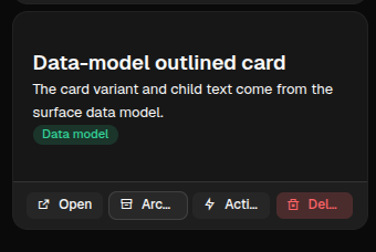
data_card = sdk.ui.Card(
"data_card",
[
sdk.ui.Title("data_card_title", bound.data("/components_test/card_model/title"), level=3),
sdk.ui.Text("data_card_text", bound.data("/components_test/card_model/description")),
],
variant=bound.data("/components_test/card_model/variant", default="flat"),
item_actions=item_actions,
data={"id": "data_card", "kind": "data_bound", "status": "active"},
)- kind: Card
id: store_card
variant: {type: store, scope: page, path: /components_test/card/store_variant, default: outlined}
item_actions: *card_item_actions
data: {id: store_card, kind: store_bound, status: active}
children:
- kind: Title
id: store_card_title
text: {type: store, scope: page, path: /components_test/card/store_title, default: Store-bound card}
level: 3
- kind: Text
id: store_card_text
text: The title and variant come from page store.
- kind: Card
id: data_card
variant: "@data/components_test/card_model/variant"
item_actions: *card_item_actions
data: {id: data_card, kind: data_bound, status: active}
children:
- kind: Title
id: data_card_title
text: "@data/components_test/card_model/title"
level: 3
- kind: Text
id: data_card_text
text: "@data/components_test/card_model/description"Direct Updates
Direct property updates must target the current surface and require explicit capabilities on the card. Use property updates for scalar properties and collection updates for children.
live_card = sdk.ui.Card(
    "live_card",
    [
        sdk.ui.Title("live_card_title", "Direct update card", level=3),
        sdk.ui.Text("live_card_text", "Actions update this card without rebuilding the page."),
    ],
    variant="outlined",
    item_actions=item_actions,
    data={"id": "live_card", "kind": "direct_update", "status": "active"},
)
live_card.allow("variant.set", "padding.set", "children.append", "children.set", "style.set", "visible.set")

surface_id = ctx["_surface_id"]
sdk.effects.ui_property_update("live_card", "padding", [10, 10, 10, 10], surface_id=surface_id)
sdk.effects.ui_collection_append(
    "live_card",
    "children",
    sdk.ui.Text("live_card_note", "Added with children.append.").to_dict(),
    surface_id=surface_id,
)
- kind: Button
id: live_card_compact
label: Direct compact
action: components.test_card_direct_padding
params: {target: live_card, size: compact}
- kind: Button
id: live_card_append
label: Append note
action: components.test_card_append_child
params: {target: live_card}
- kind: Card
id: live_card
variant: outlined
padding: [18, 18, 18, 18]
capabilities: [variant.set, padding.set, children.append, children.set, style.set, visible.set]
item_actions: *card_item_actions
data: {id: live_card, kind: direct_update, status: active}
children:
- kind: Title
id: live_card_title
text: Direct update card
level: 3
- kind: Text
id: live_card_text
text: Actions update this card without rebuilding the page.Visibility and Permissions
show_if, hide_if, and required_permissions work on the card itself. The same three controls also work on each footer action, so the card can stay visible while individual actions appear or disappear.
card.set_show_if({
    "conditions": [
        {
            "left": bound.store("/components_test/card/show", scope="page", default=True),
            "op": "==",
            "right": True,
        }
    ]
})
card.set_hide_if({
    "conditions": [
        {
            "left": bound.store("/components_test/card/hide", scope="page", default=False),
            "op": "==",
            "right": True,
        }
    ]
})
card.set_required_permissions(["components.card.view"])
- kind: Card
id: permission_card
required_permissions: [components.card.view]
show_if:
conditions:
- left: {type: store, scope: page, path: /components_test/card/show, default: true}
op: "=="
right: true
hide_if:
conditions:
- left: {type: store, scope: page, path: /components_test/card/hide, default: false}
op: "=="
right: true
children:
- kind: Text
id: permission_card_text
text: This card is controlled by store visibility and permissions.Mutable Capabilities
| Capability | Effect |
|---|---|
variant.set |
Replaces the card variant value. |
padding.set |
Replaces the card padding. |
style.set |
Replaces the common style property. |
visible.set |
Updates common runtime visibility. |
children.append |
Appends a child component to the card body. |
children.set |
Replaces the card body children. |
Screenshots
Desktop rendering:
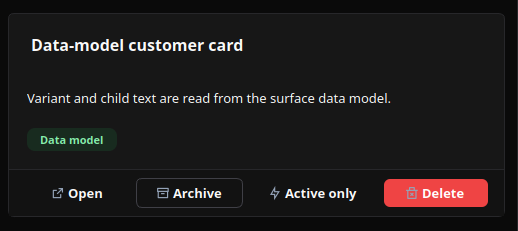
Web rendering: